Today, just having a mobile-optimized Shopify is no longer an option, instead, it is a necessity.
It’s not enough to have a website with solid Shopify SEO if it’s not optimized for mobile devices. With the growing number of mobile users, failing to optimize your Shopify store for mobile can result in missed opportunities and lost revenue.
Mobile optimization for Shopify stores goes beyond just making sure that the website is visually appealing on smaller screens. It also involves ensuring that your store is user-friendly, loads way too faster, and functions seamlessly on all types of mobile devices.
According to Statistica, retail e-commerce sales in the US are expected to increase by 710 billion dollars. Thus, it is crucial that every e-commerce website owner optimizes their store for mobile for existing as well as prospective customers.
In this blog post, we are going to discuss some most-effective Shopify mobile optimization tips that you need to start implementing today such that your store can experience more visitors and customers.
So, let’s get started!
What does mobile optimized mean for Shopify stores?
Shopify mobile optimization means that the website is designed and developed to provide an optimal user experience to visitors and customers on mobile devices, which includes smartphones and even tablets.
The Shopify mobile design is created in a way that makes it easy for users to navigate and use on a smaller screen. Also, it ensures that the online store loads quickly and functions properly on mobile devices.
By optimizing Shopify stores for mobiles, you can provide a better user experience to visitors and customers and boost the chances of getting sales on mobile devices.
Why your Shopify Store Should be Optimized for Mobile?
Optimizing your Shopify store for mobile is essential for several reasons:
- More Digital Footprints: Mobile devices are increasingly becoming the preferred method for online shopping. According to the latest research, more than half of all e-commerce transactions occur from mobile devices. Thus, by optimizing your Shopify store for mobile, you can make sure that you aren’t missing out on more prospective customers.
- Faster Loading Times: Mobile-optimized Shopify stores tend to load faster on mobile devices, providing a better user experience and reducing bounce rates. Slow-loading websites can negatively impact your sales and harm your brand’s reputation.
To learn how to increase the speed of your Shopify store, go through our guide to Shopify speed optimization. - Improved User Experience: Mobile optimization ensures that your Shopify store provides a user-friendly experience to customers on smaller screens. This probably clears that your visitors will have a smooth experience in navigating your store and finding what they have been looking for. This will increase the chances of them making a purchase.
- Better Rankings on Search Engines: Search engines like Google now considers mobile optimization as one of the major ranking factors. Thus, if your Shopify store is mobile optimized, you increase the chances of getting your website ranked high on Search Engine Result Pages. Obviously, to rank on the first page, you need to follow an SEO checklist for the Shopify store.
- Gives a Competitive Edge: More and more online businesses today optimize their websites for mobile devices. Thus, it has now become a necessity that you keep up with the competition. A mobile-optimized Shopify store can give you a competitive edge and stand apart from the rest of the businesses in your niche.
Requirements of a Mobile-Optimized Shopify Store
To optimize your Shopify store for mobile, there are a few requirements that you must consider:
- Responsive Design: The design of your Shopify store must be responsive, which means that it should adjust to different screen sizes, including smartphones and tablets.
- Mobile-Friendly Layout: The layout of your store should be optimized for mobile devices. This includes using a simple navigation menu, larger buttons and text, and a vertical scrolling design.
- Fast Loading Time: Mobile users expect pages to load quickly, so it’s important to optimize your images and minimize your code to improve your site’s loading speed.
- Mobile-Friendly Checkout: You must enhance your checkout page such that the process becomes easy to navigate on a mobile device, with clear and concise instructions and a simple form layout.
- Mobile-Friendly Product Images: Your product images should be optimized for mobile devices, with high-quality images that load quickly.
- Mobile-Friendly Product Descriptions: Your product descriptions should be concise and easy to read on a mobile device, with bullet points and clear headings to break up the text.
Shopify Mobile Optimization Tips
Now, you are ready to learn how to optimize your Shopify store for mobile. Have a look at the below-mentioned practical tips to help you along the way.
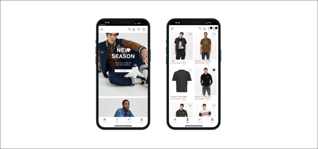
You must ensure that your store’s navigation bar is easily accessible on mobile and it is easy to find, use, and navigate, regardless of which screen size or type it is.
Below mentioned are some tips that can help you make the navigation bar accessible on your Shopify store:
- Ensure that you use a simple, clear, and concise navigation menu. Also, the icon should be easy to find and recognize.
- Limit the number of items in your navigation. Avoid overcrowding your navigation menu with too many items.
- Only include the most important pages in your navigation and use drop-down menus to organize subpages.
- Optimize for easy scrolling. Ensure that your navigation menu is easy to scroll through and navigate on a mobile device.
- Consider using sticky navigation, which stays visible as the user scrolls down the page.

2. Optimize your Images for Mobile Screens
Optimizing your images for mobile screens is an important step in mobile optimization for your Shopify store.
Below mentioned are some tips that can help you optimize your images for mobile screens:
- Use an image compression tool like TinyPNG to reduce the image file size without compromising on the quality.
- Ensure that you choose the right image format for all images in your store. For instance, you can go for JPEG for product images and PNG for graphics and other images.
- Use smaller image sizes for mobile devices. In that regard, you can use responsive images, which means that it can automatically adjust to different screen sizes.
- Use descriptive alt text for your images to improve accessibility and ensure those visually impaired users can understand the content of your images.
- Use lazy loading, which loads images as the user scrolls down the page.
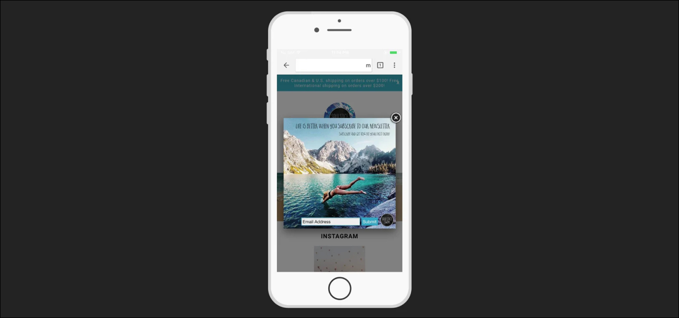
3. Avoid Pop-Ups
Avoiding pop-ups is an important tip for mobile optimization on your Shopify store. By avoiding pop-ups or using them judiciously, you can improve the mobile experience for your customers and increase the chances of conversion on your Shopify store.
Here are some reasons why you must avoid pop-ups on your mobile devices:
- From a customer’s point of view, it could be irritating for one and difficult to close on a mobile device. This can lead to poor user experience and discourage customers from making a purchase from your store.
- Pop-ups can result in slow load times of the store which can again prove to be problematic on mobile devices.
- Search engines like Google consider pop-ups to be a disturbing element. It can even penalize your store from getting ranked on SERPs.
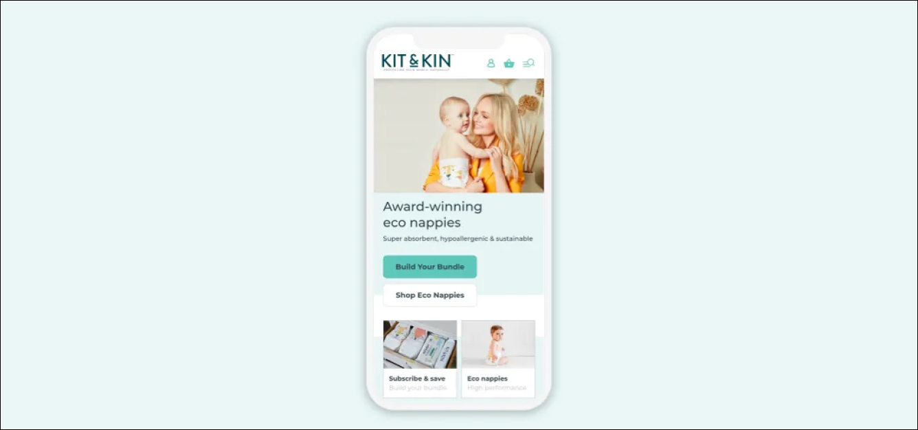
4. Hone CTA Buttons
Honing CTA buttons refers to the process of refining and optimizing the call-to-action (CTA) buttons on your Shopify mobile website in order to improve user engagement and conversion rates.
Below mentioned are a few helpful tips that can help you optimize your CTA buttons on mobile devices:
- Ensure that your CTA buttons are easy to locate and click on such that it stands out from the remaining page elements.
- Keep in mind that you use clear and concise language on the CTA buttons such that users know what action will be performed immediately after clicking on the button.
- Keep your CTA buttons short, with no more than two or three words. This makes them easier to read and understand on smaller mobile screens.
- Use contrasting colors for your CTA buttons such that it draws the user’s eye to the button and encourage them to take action.
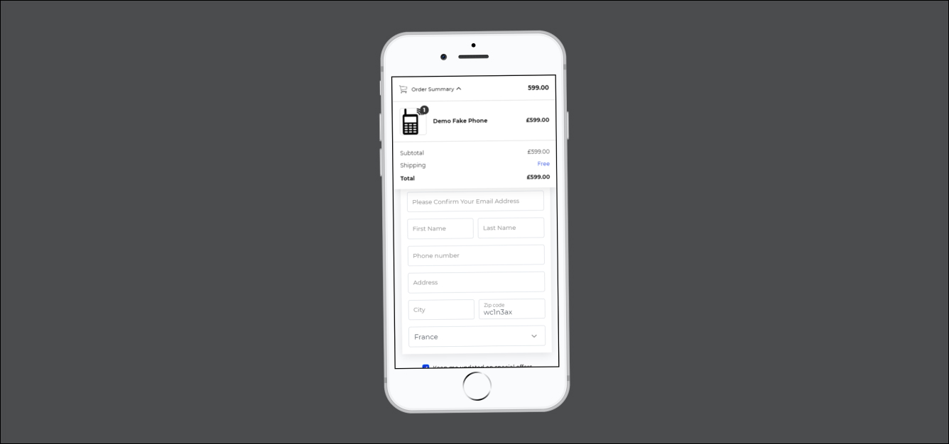
5. Optimize the Checkout Page for Mobile
Optimizing your Shopify store’s checkout page for mobile plays a key role in improving the checkout experience on your online store. This way, your users can easily and conveniently navigate the website and complete the purchases on mobile.
Here are a few tips that can help you optimize your checkout page for mobile devices:
- Reduce the number of steps that are required in your store for completing the purchases. The lesser the steps, the faster customers will complete the purchases.
- Specifically, design your checkout page for mobile devices with a clean, simple, and intuitive mobile 6layout.
- Consider using auto-fill options to make it easier for users to complete the required information on mobile devices.
- Ensure that your checkout page loads quickly on mobile devices. Slow loading times can lead to users abandoning their carts.
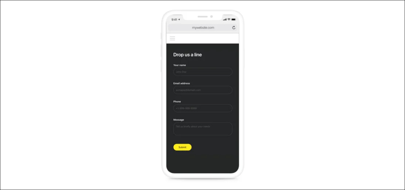
6. Use Mobile Forms Correctly
Forms are essential to collect customer information, and using them correctly can make a difference in converting visitors into customers. Optimizing all the forms on your Shopify mobile website to make them easy and convenient for users to fill out on their mobile devices.
Below mentioned are a few helpful tips that you can take into account while optimizing forms for mobile devices correctly:
- Keep the forms short and only ask for the essential information you need.
- Use auto-fill features to make it easier and faster for users to fill out forms on mobile devices.
- Design your forms specifically for mobile devices, using large buttons and clear fields that are easy to select and navigate.
7. Optimize Mobile Page Speed
Website speed plays a crucial role in providing an optimal user experience and can also impose a significant impact on conversion rates. Thus, ensure that you improve the loading speed of your Shopify mobile website to ensure that it loads quickly on mobile devices.
Here are a few tips that can help you optimize mobile page speed for your Shopify store:
- Compress and optimize your images to reduce their file size without sacrificing quality.
- Avoid using large files like videos or music on your mobile website, as they can significantly slow down the loading speed.
- Optimize your website’s code and scripts to reduce their size and improve loading speeds.
- Use browser caching since it allows you to store frequently used files, reducing the number of requests made to your server and improving loading speeds for returning users.

How to Check if Your Shopify Store is Mobile Optimized?
Although all the above-mentioned tips for Shopify mobile optimization are great, it’s equally important that you perform a check on every strategy implemented.
Here are some specific checks that you need to perform:
- Pagespeed Insights: Firstly, you need to compare both mobile and desktop speeds. Also, compare the pre-and post-changes since it will help you understand where you are lacking and what you need to do further.
- Google Search Console: If any mobile-related issue is detected in your store, you can have a detailed view of that issue under Mobile Usability in the Experience Report. Resolve the issue and mark them fixed and Google will re-crawl the page.
- Google Analytics: If you have access to Universal Analytics, you can have a detailed report on the Site Speed. Also, you can get a chance to compare your actual mobile performance with your website benchmarks.
- Google’s Mobile-Friendly Test: Here, you’ll be able to have a look at the issues in detail that you may not otherwise find in the script.
- Your Browser: One of the best tools that can help you identify and debug mobile-related issues is the console in your browser. Use it and improve the mobile experience for your users.
Is it Difficult to Optimize the Shopify Store for Mobile Yourself?
Implementing the above-mentioned tips can help you optimize Shopify for mobile devices. Yet, these are some basic recommendations that can help you get on the track of Shopify mobile optimization.
If you require high-quality optimization, you need to take help from an experienced developer. Otherwise, you will end up wasting time and money on solutions that won’t make a difference.
Thus, it is always the best idea that you seek help from professionals for advanced mobile optimization. You can even consider taking help from us to deliver your Shopify store with a top-notch mobile experience.
Wrapping Up
Running and managing a successful e-commerce business in 2023 is a real challenge.
Mobile shopping is now becoming more and more popular and thus it is crucial that you work on Shopify mobile optimization such that you get more conversions.
Now that you’re well aware of how to optimize the Shopify store for mobile, it is now time that you start working on the Shopify mobile optimization tips. Let’s give your customers a seamless mobile experience, improve conversion rate, and increase the profit margin.
If you still have any queries or concerns about Shopify mobile option, don’t hesitate to contact us. We are renowned as a top Shopify development company and have a pool team of experienced Shopify developers who can help you run your business on Shopify.